Typefaces
Typefaces
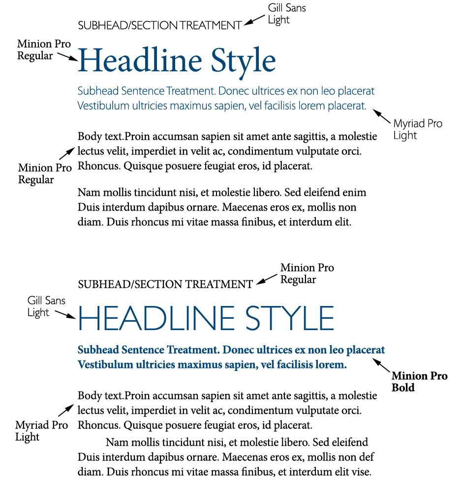
NPS has four typeface families used for print media: Trajan Bold, Minion Pro, Myriad Pro and Gill Sans. Used in conjunction, they project a strong, historical and sophisticated tone. These are provided in both PC and Mac formats.
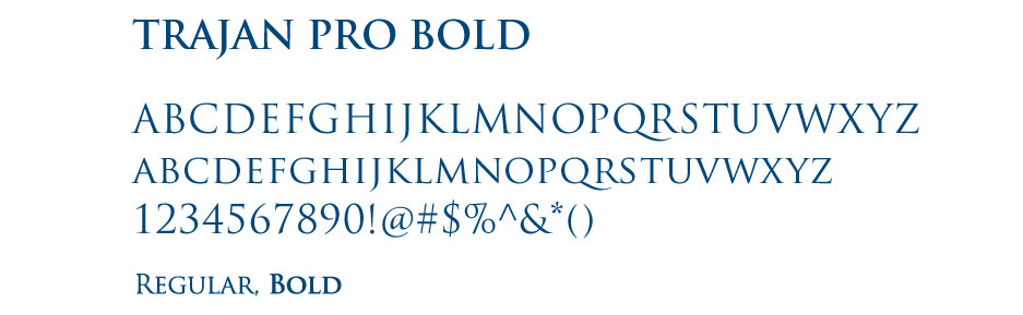
Trajan is the font our logo is typeset in. Since it is NPS’ logo font, it should be reserved for official names of schools, departments, centers, institutes and report titles, with very few exceptions. It is never to be used for headlines or body copy. By keeping it reserved for NPS titles, it becomes more distinctive and noticeable when used as our logo or for school names.
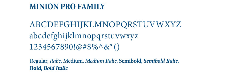
Minion Pro is the required daily-use font for written communications. It is a serif font which makes reading paragraph copy easier to read as the little “feet” help lead the eye from character to character, word to word. It should be used instead of Times New Roman and Calbri in Microsoft Word.
To change the default font in Microsoft Word, follow these steps:
- Create a new document.
- Under the Format menu, click Font. Select Minion Pro, point size 12.
- Click Default. You will be prompted with the confirmation message, click Yes.
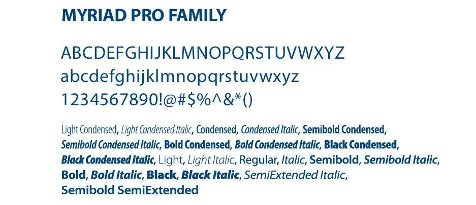
Myriad Pro is the supporting sans-serif font and used for print and Web as it is especially clear and easy to read on screen. With the different weight variety, it is a great font for newsletters. The condensed versions also work well for headlines and small type in print communications.
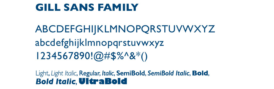
Gill Sans is a supporting sans-serif font reserved for headlines, subheads, supporting information, small type and graphs. The regular and light weight versions are elegant in all caps, while the bolder weights should be used sparingly.
Reserved for report titles and university, school, department, center group names and logos.
Daily use for documents, reports, body/paragraph copy.
Daily use for documents, reports, body/paragraph copy, condensed versions work well for headlines and small print.
Typography
Consistent Typography
Consistent use of typography will help build an immediately recognizable image for NPS over time through use in all communication materials.
Alignment
Always be consistent with alignment throughout a document. Aligned left is preferred. Avoid center type, especially in paragraphs, as it is harder to read.
Typographic Hierarchy
Create a consistent structure for documents with clearly defined headlines, subheads and body copy.
Color Treatment
Body text color should always be 100% black for best reproduction and legibility. To add color and help distinguish sections, NPS blue can be used for headlines and subheads, while 40% and 65% black can be used for subheads and graph labeling.
White Space
White space is essential to readability and makes various elements stand out. Avoid covering every inch of a document with text and photos. This results in publications that are visually unwelcoming and difficult to read.
Typographic Layout Examples